Design a Ways to Give page: Crash course and best practices


What kind of user journey does your nonprofit’s website offer?
Imagine a visitor has landed on your website for the first time. They’re vaguely familiar with your organization’s work in the community, and they want to learn more.
They take a look at your homepage and read about your mission. They scroll through a gallery of photos from your programs and on-the-ground work. They even see a few testimonials from your constituents and partners. Inspiration strikes, and they want to give a small gift to help sustain your work!
Now comes the moment of truth—will the visitor be able to easily find a way to donate?
If your website adheres to web design best practices and includes a clearly labeled Ways to Give page, there’s nothing standing in your visitor’s way.
This guide will cover everything you need to know about Ways to Give pages, including why they’re so important and the best practices you should keep in mind while designing your own.
What's a Ways to Give page?
A Ways to Give page is a page on a nonprofit’s website that highlights the various ways that donors can support the organization. These might include:
- Online donations
- Mailing a cash or check donation
- Joining a membership program
- Bequests and other forms of planned giving
- Giving donations of stock
- Giving from a Donor-Advised Fund
- Donating in-kind gifts
- Sponsorships
- Volunteering
The Ways to Give page serves as a central hub for all of the nonprofit’s giving options. It should either provide instructions and impactful information for each form of giving or link to separate pages that explain the giving programs in-depth.
Why are these pages important?
An effective Ways to Give page plays an important role in the donor journey created by your nonprofit’s website.
It facilitates giving by providing visitors with a clear understanding of all their available options and makes it easy for them to find their ideal method.
It also acts as a central touchpoint in a clear, well-organized path to giving. When inspired donors can easily find your Ways to Give page, you minimize the chance that they might not be able to find what they’re looking for, become distracted or dissatisfied, and give up on making a donation.
Including a well-designed Ways to Give page shows that you’ve put thought into the experience you offer visitors, one that respects their time and makes giving easy.
What should a Ways to Give page include?
Let’s take a look at the 5 most important elements that should be included on a Ways to Give page:
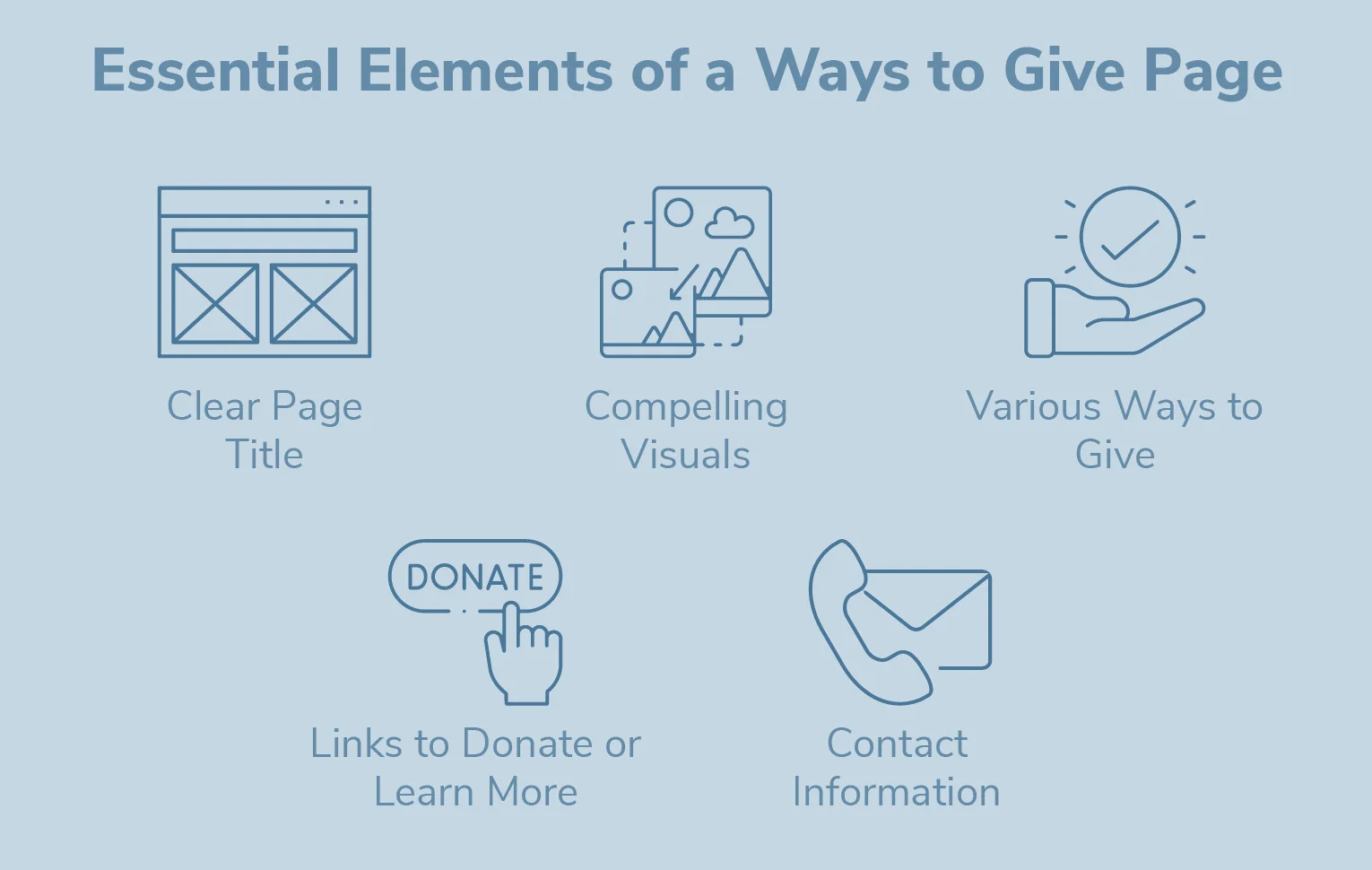
- A clearly labeled title. Let visitors know they’ve arrived at the right place with a clear Ways to Give title. Feel free to get creative to reinforce your brand or mission, but ensure that the purpose of the website remains very clear.
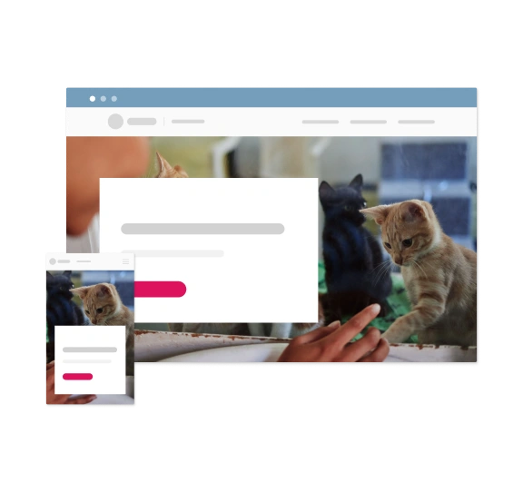
- Compelling visuals. Lead with a large photo that reflects your mission and draws visitors in. Photos of people or animals will work best to capture attention and forge a quick connection. Depending on your layout and design preferences, each individual way to give might include additional photos to catch the eye.
- Your ways to give. They should be grouped intuitively and organized in an easy-to-understand layout of separate sections or tiles. If you have unique names for your giving programs, like a “Legacy-Builders Society” for planned donors, feel free to include them, but not as the primary means to indicate that way to give. Newcomers won’t be familiar with these names or other program-specific terminology.
- Links. Each way to give should ideally link to a dedicated page that provides more information about that giving program and the impact it drives. You can link on the tile or associated image for that way to give, but be sure to include an actual line of linked text that encourages action, like “Click here to learn more.” For some ways to give, like sponsorships, it can also make sense to directly provide readers with contact information so that you can begin personally discussing the partnership right away.
- Contact information. Visitors might navigate to your Ways to Give page because they already have a specific question about one of your giving programs. Streamline their journey by providing contact information upfront for your general donor relations office and for individual giving program coordinators.
What Ways to Give page best practices should nonprofits follow?
Aside from including all the essential content elements, there are additional best practices to keep in mind to help your Ways to Give page provide the best possible experience to site visitors and potential donors.
- Streamlined design. Your Ways to Give page should be uncluttered, with clearly labeled sections, appealing colors, and compelling but unobtrusive visuals. Avoid including any unnecessary design or content elements that don’t serve the main purpose of the page.
- Consistent branding. Reflect your organization’s visual brand, including logos and colors, in your Ways to Give page so that it coheres with the rest of your website and assures donors that they’re in the right place.
- Concise, impact-centric language. Your Ways to Give page isn’t the place to get into the nitty-gritty of how each giving program works. Provide a few paragraphs reinforcing your mission and the importance of donations, then a concise description of each way to give.
- Strategic order of importance. If you want to call special attention to one of your giving methods, your Ways to Give page offers the perfect opportunity! Lead with your most popular ways to give, like straightforward online donations, but also emphasize others, like DAFs, planned giving, and more depending on your organization’s priorities.
- Social proof and testimonials. Including one or more brief sections that highlight donor testimonials can motivate more giving through the power of social proof. A short quote, a photo, and a line stating the relevant giving program can go a long way to show prospective donors that your cause is worth supporting.
- Technical optimization and accessibility. Your Ways to Give page will only drive results if donors can actually use it. Take the time to test your page on both desktop and mobile browsers. Note any elements that are difficult to use or that slow down the page’s load speed, and adjust, remove, or compress them as needed. Ensure that your page (like the rest of your website) adheres to web accessibility best practices to avoid turning away any interested donors and prevent potential liabilities.
Ways to Give page examples: Best practices in action
Let’s take a look at a stellar Ways to Give page and how it uses the best practices listed above to take its visitors on a journey.
The National Museum of Wildlife Art in Jackson, Wyoming, created a beautifully designed website that offers visitors a smooth, compelling experience. The Museum also partners with FreeWill to support its planned and tax-smart giving programs, hosted on a dedicated Planned Giving Microsite.
But before visitors can dive into these program-specific pages, they first navigate the main Ways to Give journey that the Museum created.
Imagine you’re a prospective donor interested in learning more about bequests. What route will you follow? We’ll examine the whole journey, from the main Ways to Give page to introductory information about planned giving to the dedicated Planned Giving Website by FreeWill.
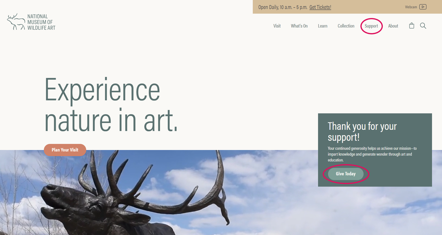
When you arrive on the Museum’s homepage, there’s an option in the main navigation bar titled “Support.” This ensures that visitors looking for a way to give can easily find it, no matter how they arrived on the website or which page they’re currently viewing. Bonus points for the front-and-center donate option and mission statement!
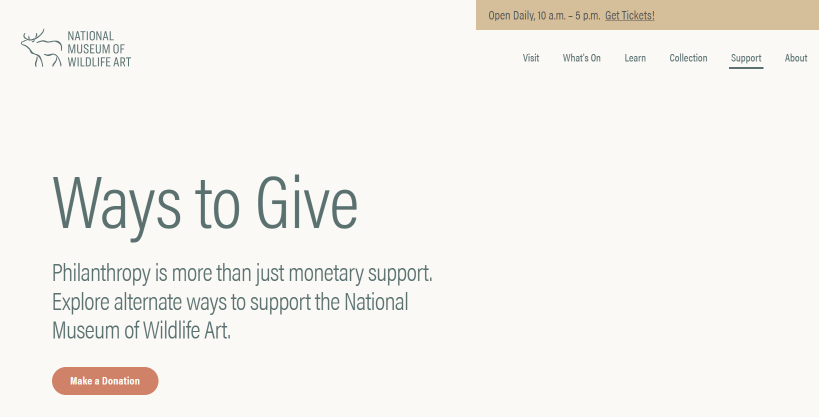
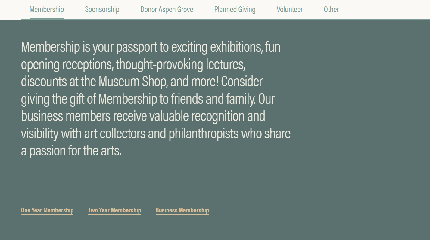
After clicking through to the Museum’s main Ways to Give page, we’re greeted by a bold title section that makes immediately clear what the page is about. A blurb under the title concisely explains that there are multiple ways to provide support, all of which are impactful. A button that goes straight to the online donation form ensures that any page visitors who want to make a one-time gift can easily do so, as well.
As we scroll down, we see that each way to give has its own dedicated section on the page.
First is memberships. The sustained support and engagement generated by membership programs are especially valuable for cultural institutions like museums. By using a strategic presentation order, the Museum can make sure that anyone who visits this page will be exposed to their membership options. Another concise explanation lays out the benefits of joining the program. It’s followed by clearly-labeled links to learn more about the different program tiers.
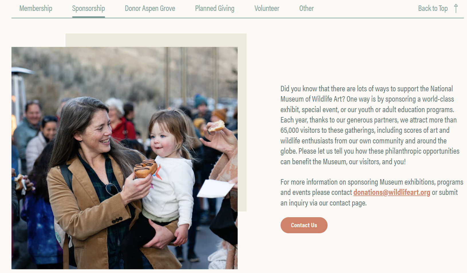
The next section is dedicated to sponsorships. It explains the value that sponsoring an exhibit, event, or program can create for the Museum, the community, and the sponsoring organizations themselves—note the mention of the Museum’s impressive annual attendance numbers. There’s also a scrolling gallery of real photos from the museum’s past events.
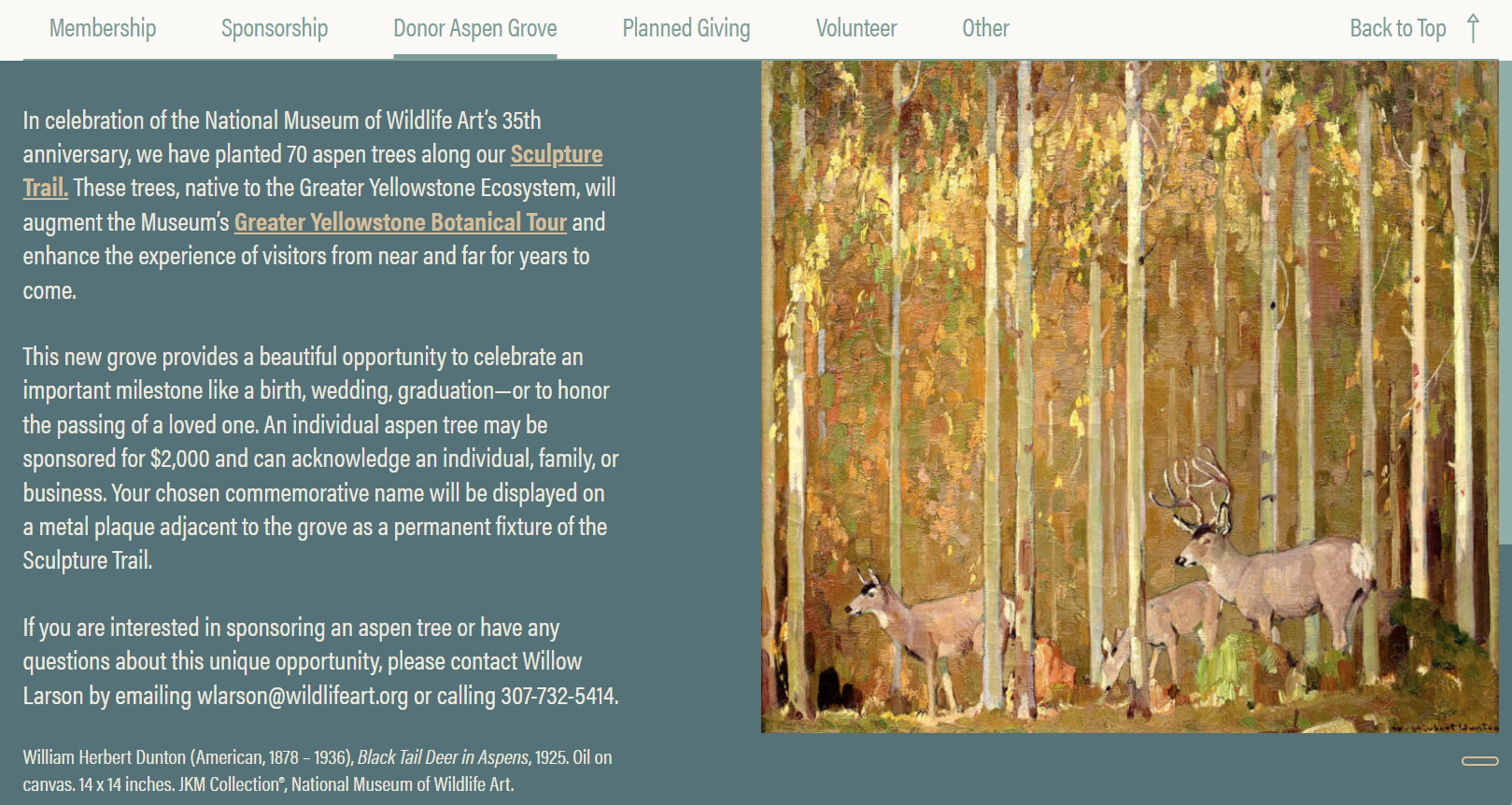
Next, the Museum takes the opportunity to promote one of its more unique giving methods: a chance to dedicate one of 70 newly-planted trees in their sculpture garden. Since it’s featured on such a prominent page in the user journey, this unique twist on the classic donor wall or engraved brick campaign will be sure to catch the eyes of interested donors.
Next, the page promotes another important way to give—planned giving. In a few short paragraphs, it clearly introduces the concept of planned gifts, mentions the benefits and impact that they bring, and encourages interested donors to explore further or reach out directly with questions.
A list of links on the right side of the section shows readers the different types of planned gifts and non-cash gifts that they can make, including bequests, beneficiary designations, annuities, stocks, DAFs, and more. There are also links to sample legal language that donors can use or explore.
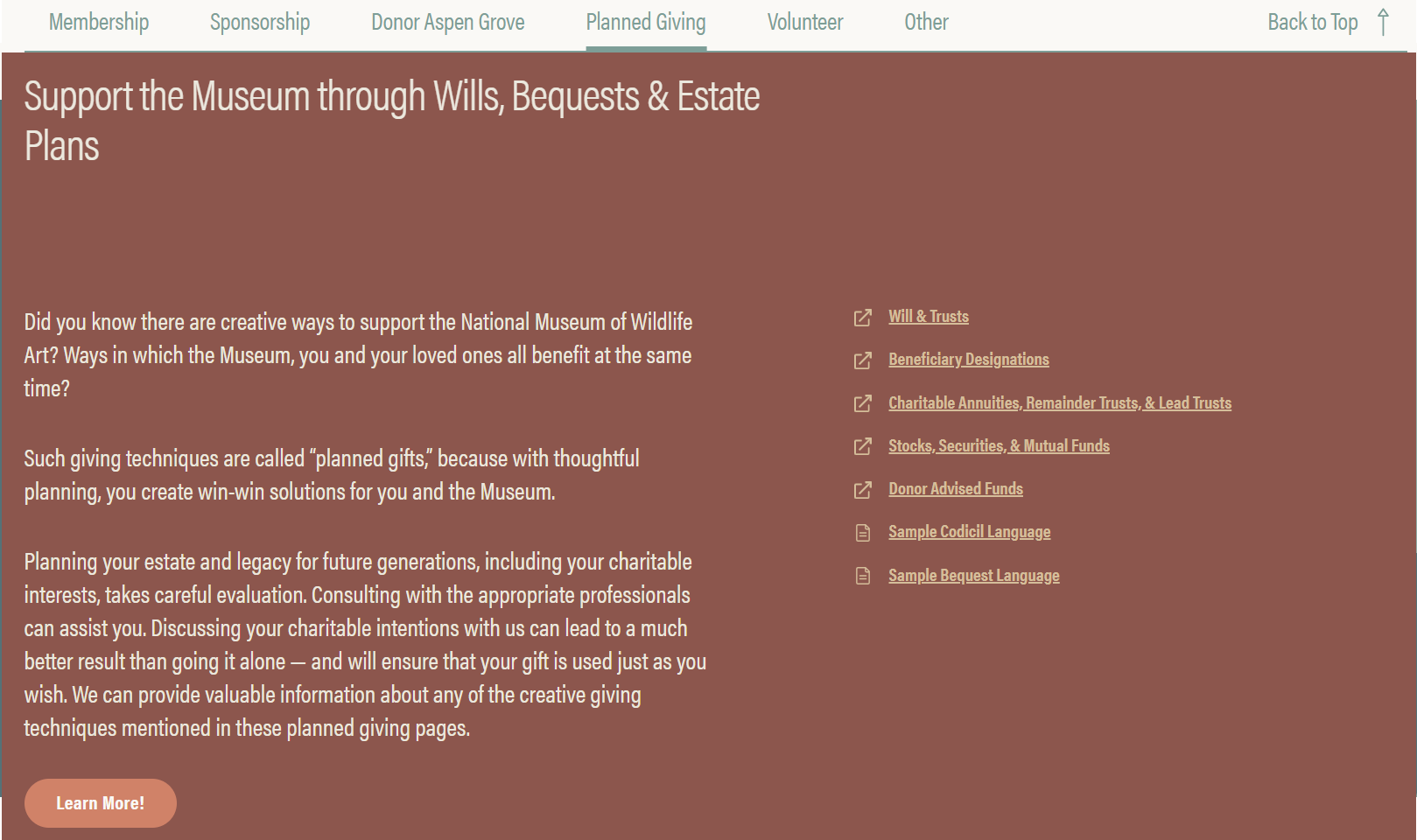
Each of these links takes readers to different parts of the Museum’s Planned Giving Microsite, created in partnership with FreeWill.
A seamless donor journey to planned giving
What’s a Planned Giving Microsite? This standalone set of pages is separate from your main Ways to Give page. It educates visitors about making planned and tax-smart gifts while facilitating the giving process for the organization.
By creating a separate Planned Giving Microsite, the Museum centralizes the online planned giving process, has a dedicated place to direct prospective donors, and can easily collect the information it needs to manage its program. Here’s how it looks to visitors:
Welcoming language, appealing visuals, consistent branding, and an organized layout ensure that visitors interested in planned giving can smoothly continue their journey.
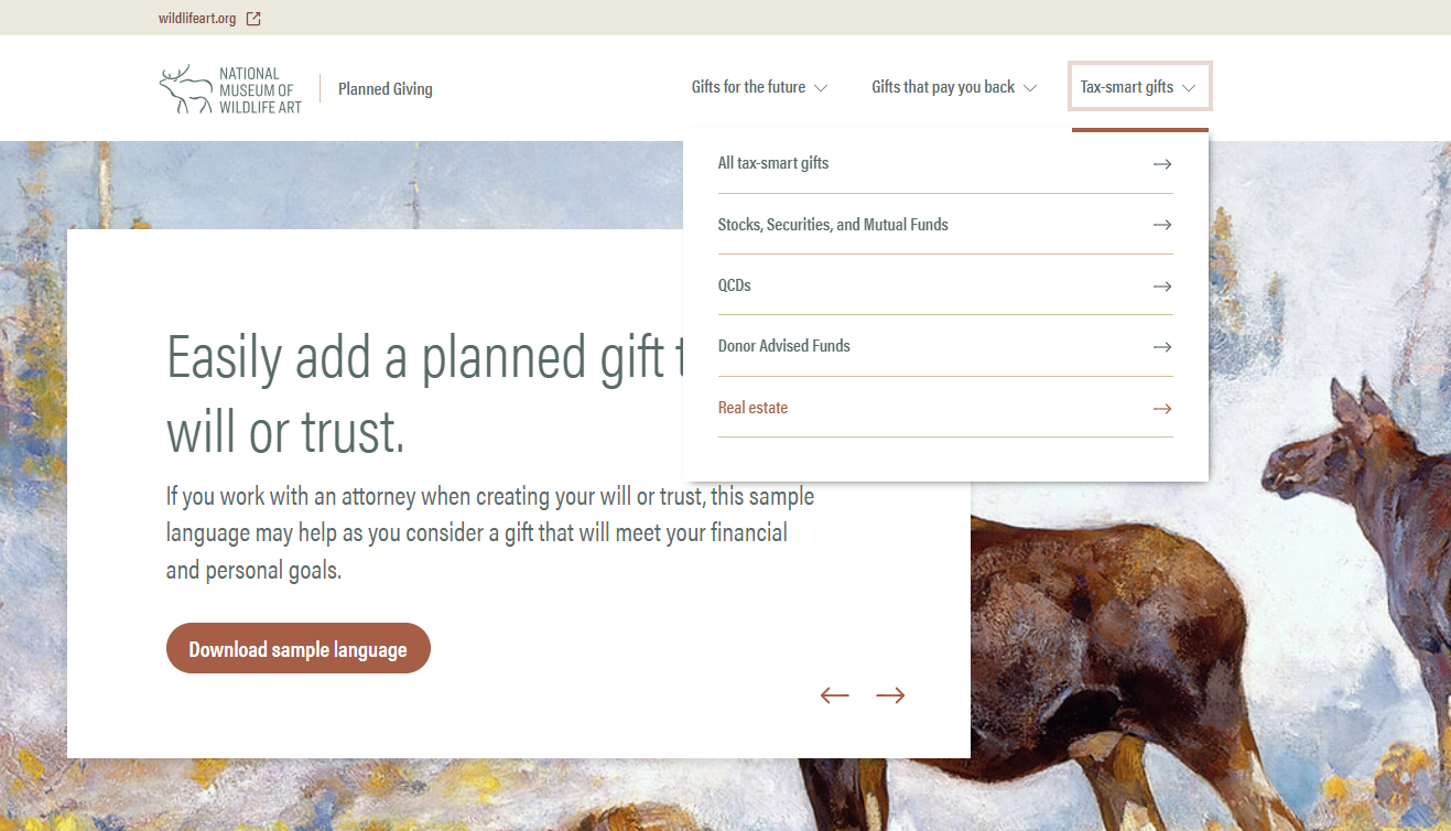
The navigation bar even separates the different types of planned gifts into compelling categories: “gifts for the future,” “gifts that pay you back,” and “tax-smart gifts.” These small touches encourage potential donors to explore the website, learn more about all their options, and begin the process of creating a planned gift.
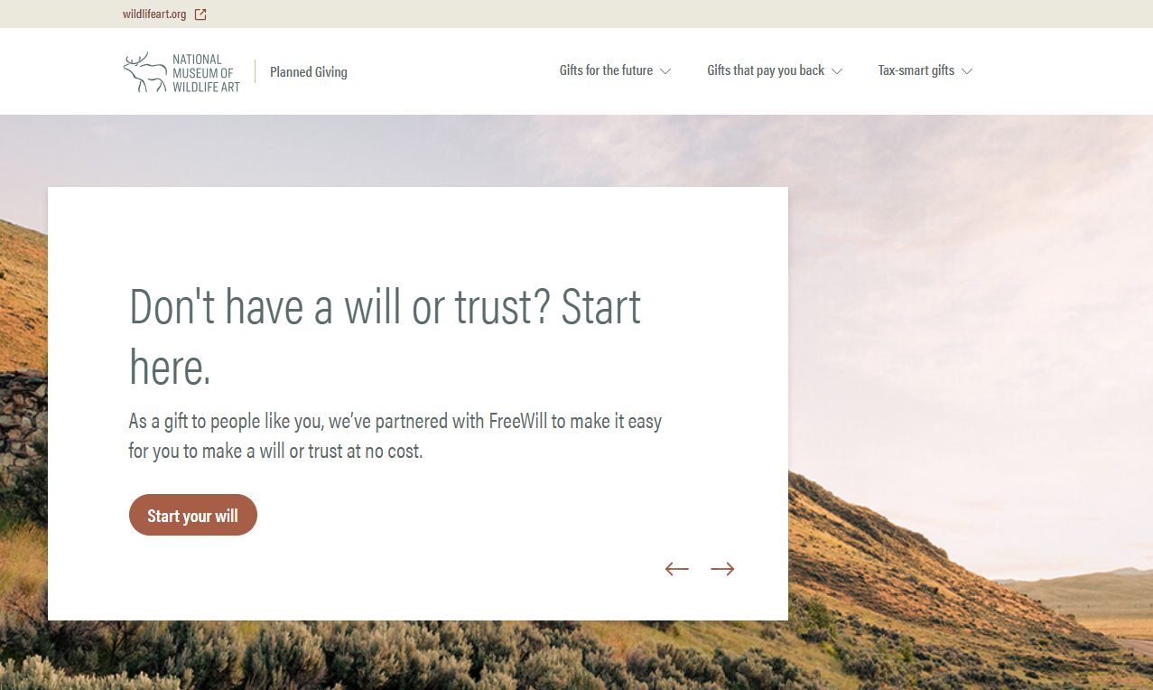
Let’s say you decide to learn more about gifts made through wills and trusts. This page of the Museum’s Planned Giving Microsite offers more specific language and helpful information within the same tidy layout.
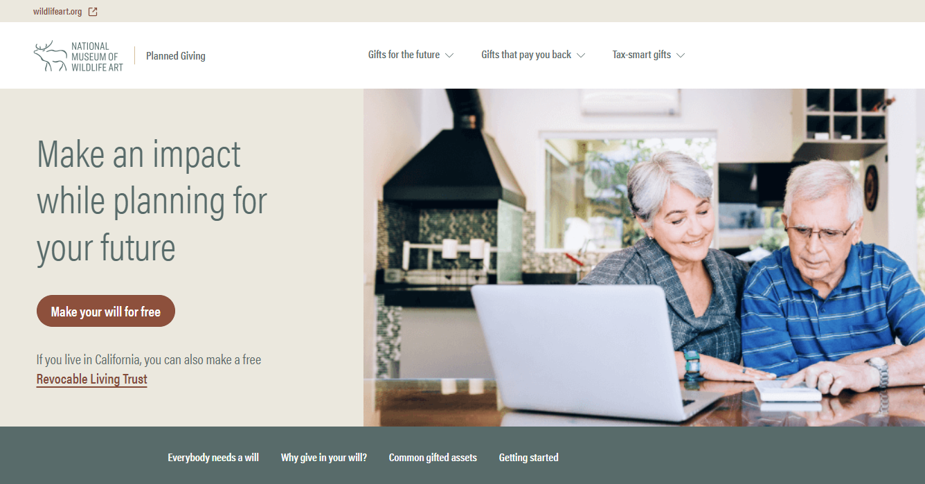
You’re inspired to take action, make a will, and create a legacy gift for the Museum—great! Clicking the prominent call-to-action button takes you to a free estate plan creation tool from FreeWill.
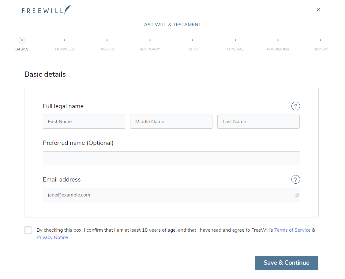
The Museum uses this tool to offer its supporters an easy, free way to make a will and create a bequest gift (designating a portion or remainder of an estate to be given to the organization). The interface is uncluttered and user-friendly, smoothly guiding donors through a step-by-step process. And by partnering with FreeWill to centralize the experience, the Museum also ensures that it can gather the necessary data to grow its planned giving program and actively steward its new legacy donors over time.
Creating a more seamless giving experience
This example from the National Museum of Wildlife Art illustrates how nonprofits can create seamless online giving experiences, anchored by their Ways to Give pages, that encourage engagement and giving.
Within the different giving programs that you promote on your Ways to Give page, it’s important to consider how your donors’ journeys will continue once they click through to learn more.
In the example above, readers are either directed to contact information to get in touch right away or separate pages that offer in-depth information and forms for initiating their gifts.
Planned giving is a great example—these gifts can be more complicated or unfamiliar than others, so a dedicated Planned Giving Website can be particularly valuable for explaining their benefits and how they work. Many nonprofits also opt to promote other forms of tax-smart and non-cash giving alongside their planned giving programs, so a central digital location simplifies the possess of promoting these options, too.
FreeWill can help your nonprofit create a beautiful Planned Giving Microsite completely tailored to your brand, mission, and needs. Check out this interactive example:
By being intentional about the giving experiences you create, you can see some incredible results. Wills made on our platform are 5 times more likely to include bequests, and at sizes more than twice the national average. Give your donors a simple way to create estate plans and leave bequests, back it up with an intuitive, engaging website, and start promoting your program.
Learning more and getting started
To drive results and forge lasting relationships with donors, nonprofits need to foster engaging online journeys. As the central hub that ties your giving programs together, educates donors, and encourages giving, your Ways to Give page plays a pivotal role in shaping this journey.
Think of your Ways to Give page as a value-generating asset, more than just a simple donation form and list of links. Put time and thought into the experience it creates, from the language it uses to the visuals it includes. Invest in additional tools that improve the donor experience and make your job easier, like FreeWill’s Planned Giving Microsites.
Want to learn more about building thriving giving programs? We recommend these additional resources:
Build a lasting legacy for your mission
Amplify and accelerate your program with FreeWill's Planned Giving Microsites.
Build a lasting legacy for your mission
Amplify and accelerate your program with FreeWill's Planned Giving Microsites.